Collegiate Link
Collegiate Link
Overview
"The leading platform to centralize, organize, and increase student involvement opportunities" - campuslabs.com
CollegiateLink is used at over 200 higher education institutions across the country. Over the summer of 2015, CollegiateLink got a face-lift when we redesigned the main student-facing event, organization, and campus home pages.
After the initial redesign was started, I was brought on to help clean-up and upgrade the parts of the application that wouldn't be totally rewritten. With limited time and resources, I focused on three major areas to improve the user experience: accessibility, responsivesness, and lightness.
Accessibility
In the 10 years since the original build of CollegiateLink, our UX team has worked hard to make accessibility an integral part of the design process across all our products. I wanted to make sure that any update to CollegiateLink included a serious look at accessibility. After an initial audit, we made some significant improvements:
- Following HTML standards and element hierarchy
- Optimizing the wording and visibility of all call-to-action elements
- Making sure every input had a valid label and could be accessed with a keyboard
- Standardizing common form elements, especially required fields
- Standardizing interactions across the site
- Ensuring color contrast standards were me on all elements
- Removing some customizable elements that allowed the user to select font and color combinations that were not accessible or legibility friendly
- Adding "Skip to Content" links on all pages
We also decided to remove some customizability of fonts and font colors that allowed our customers to get them in an inaccessible state. Instead, we now offer a set of fonts that are tested for readability and contrast standards. Where we choose to let users customize colors, we added in tools that help identify color combinations that don't pass accessibility standards so our users could make informed decisions.

Responsive & Mobile Friendly
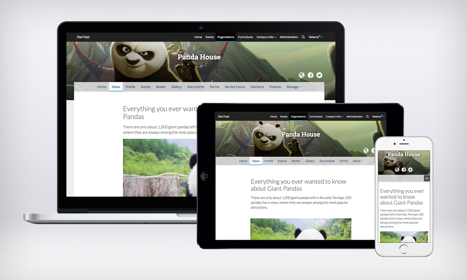
This project coincided with the release of our new Campus Labs style guide built with Sass on top of Bootstrap. By removing the custom static grid and implementing Bootstrap's grid, we were able to give CollegiateLink a fluid, mobile-first layout. This necessitated rewriting a lot of HTML and CSS and removing fixed width elements, but the result is a fully fledged mobile site that is available to our users when and where they want to use it. Adding the responsive grid allowed us to reformat and improve many internal pages and forms, which will be discussed next.

Lightness & White-space
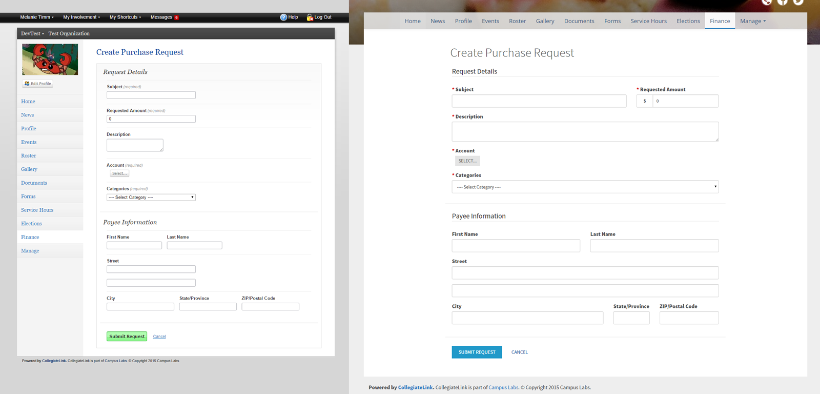
CollegiateLink is a very powerful product for managing lots of different involvement tasks and workflows on campus. While we generally strive to make all our workflows as smart and smooth as possible, many campuses ask users to supply a lot of information in very long forms. Because data collection is so central to product workflow, we spent a lot of time optimizing forms and layouts to increase user fatigue:
- Standardizing forms types to fit one of 3 layouts depending their purpose
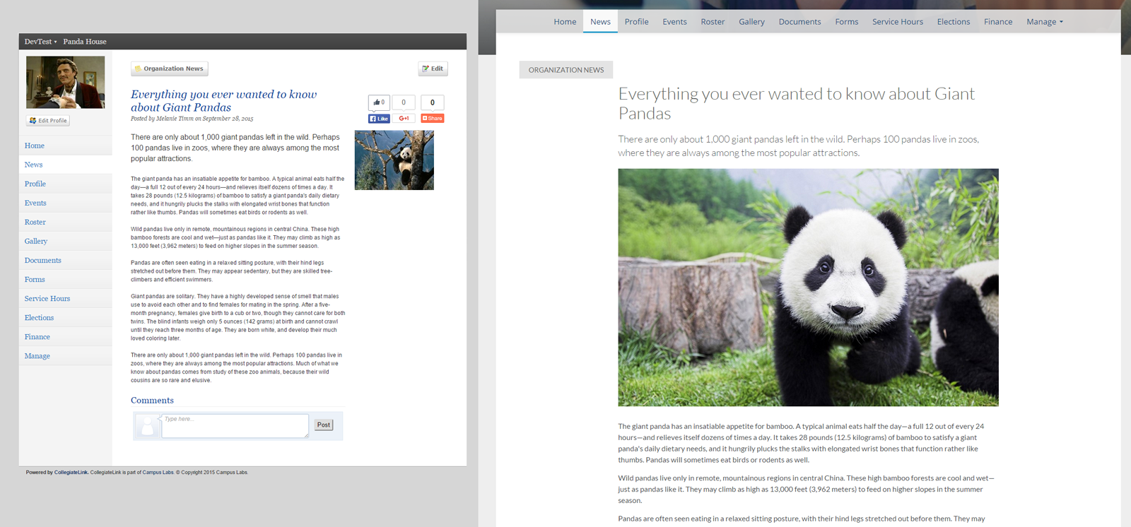
- Adding more white-space to all elements and layouts
- Highlighting primary actions and minimizing secondary ones
- Adding visual cues and extra spacing between form sections
- Increased font-size and line-heights
- Standardizing required form fields and helper text
These small, but necessary improvements ease data submission by helping users fill out forms as quickly and painlessly as possible, and aid data review by presenting the data collected in a thoughtful, useful, and legible way.
